As a tech leader, you know design shifts aren’t just about aesthetics; they reshape user expectations, impact engagement, and can make or break product adoption. Apple’s unveiling of “Liquid Glass” marks its most significant UI transformation in over a decade, and whether or not your organisation builds on iOS, this change will influence what users demand everywhere. The question isn’t if Liquid Glass will affect your roadmap, but how quickly you’re prepared to adapt before your product starts to look dated in a market where perception equals credibility.
What is Liquid Glass?
At their annual developers conference in June, Apple debuted their reimagined user interface paradigm. It had been rumoured since 2024 that the glassy UI design of VisionOS, the OS that runs Apple’s Vision Pro headset, would become the eventual standard on iOS too. However, the announcement of what Apple is calling “Liquid Glass” has proved a greater ambition: a unified design language that represents the largest UI change in twelve years.
Since the renunciation of skeuomorphic design with the launch of iOS 7 in 2013, a key focus has been to elevate content and keep UI chrome minimal and unobtrusive. Liquid Glass pushes this concept even further by making more of the interface transparent or translucent, blending and borrowing colours from the surrounding content. Where the iOS 7 design whitewashed away leather textures and hand-crafted iconography, arguably, it robbed a lot of apps of their personality.
Liquid Glass is once again injecting a little fun and playfulness while keeping the visual sophistication you’d expect from a premium product line.
Courtesy: Apple Inc.
As someone steeped in the Apple ecosystem for the past 25 years, I’m old enough now to have lived through two major UI revolutions instigated by Apple. That, and to have seen naysayers consistently proved wrong in their predictions as Apple has climbed to become a trillion-dollar company after being on the verge of bankruptcy at the turn of the millennium.
The Millennium: An explosion of colour
In January 2000, Steve Jobs stood on stage at Macworld Expo in San Francisco and announced Aqua as the new user interface for the Mac. It was a radical departure from the grey, 3D bezelled look of earlier Mac OS’s – and, of course, Windows.
Translucence, colourful liquid drops, pin stripes, it was a lot to take in! It immediately made the flat grey look of Mac OS 8 and Windows 2000 look very dated and boring.
Jobs was always the showman, and it’s hard to imagine today a presentation to a packed hall showing what checkboxes would look like in a new operating system, as being exciting – but it was and I think it really set the ball rolling on what went on to be come the golden age of desktop software on the Mac and inspired me personally to get into building software for the Mac.
Aqua wasn’t perfect at first, of course, and it continued to evolve and improve with each subsequent OS release, year after year. Gradually, more textures, animations and effects crept into interfaces; brushed metal, wood and leather. The high-fidelity digital representation of the analogue world showed just how powerful the computers and operating systems had become. What had started off feeling a little slow on even the highest-end systems was now trivial to render even on a smartphone by 2007.
iOS 7: Minimal UI and simplified icons
In June of 2013, Craig Federighi stood on stage at WWDC to announce the UI update that was coming with iOS 7. After years of more and more textured and skeuomorphic designs, iOS 7 swept all that away with a focus on minimal UI, skinny typography, and simplified icons.
Older designs that still leaned on skeuomorphism, gradients, and textures immediately looked like something you’d unearthed in an antiques shop.
As with Aqua, it was a shock to the system at first, and there were accessibility regressions that took some time to be ironed out. The accessibility section of the Settings app ballooned with options to re-add button borders, increase contrast, and make fonts bolder.
But with each new release, the design was refined into what we have today. A slightly bland, but highly serviceable UI style that has become ubiquitous across the digital world.
At first, I have to admit to rather hating flat design; it was just so visually boring, and that it was coming about just as we were getting the highest fidelity screens we’d ever had seemed like a bit of a gut punch.
You have 300dpi (or more) on screen now, but everything is just black and white!
Thankfully, things gradually evolved and became a bit more comfortable and less stark. Although I’ve still always yearned for a bit more colour and texture in UIs, not least because of the usability improvements they confer (we’re much faster at recognising differences in icons or controls if they differ by colour as well as shape for example).
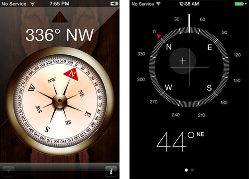
The Compass app that ships with the system, here in its skeuomorphic guise in iOS 6 and then its ultra-modern look in iOS 7.
Moving quickly to adopt Liquid Glass could give you a competitive advantage
So, fast-forwarding to the present day, we now have a new transition to deal with again after 12 years of evolution of the so-called “flat design” language. The lessons we can take from the past redesigns are that:
- Apps that aren’t updated to adopt the design language of the day look unfashionable at best and abandoned at worst.
- Big UI changes are painful for everyone at first – they take time and investment from developers, and there is a cognitive load on users to become accustomed to the changes.
- The design continues to evolve to address pain points, so judging it too harshly or writing it off based on its first public demonstration is foolhardy.
- The latest design will feel unequivocally better in hindsight, just as every seismic shift in UI has before it.
The question for you now, as a product owner, designer, or developer, is ”how are you rising to meet the challenge?” Do you risk your app’s design becoming stagnant and dated-looking?
Research has shown that
75% of users judge a company’s credibility based on design quality, and apps with poor UX can lose up to 88% of users after just one bad experience.
In a marketplace with over 1.8 million iOS apps, that can be the difference between growth and obscurity. What first-mover opportunity are you able to exploit by getting ahead of your competitors? And if you have a cross-platform app, how will you handle the growing UI differences between Android and iOS without alienating users of either?